CATEGORY:
PACKAGING
& BRANDING
COLLINA
VIOLA
APERITIVO
COLLINA VIOLA APERITIVO
LOCATION:
BROOKLYN, NY

INDUSTRY:
FOOD & BEVERAGE
FOOD &
BEVERAGE
TOOL(S):
ADOBE ILLUSTRATOR
& PHOTOSHOP
ADOBE
ILLUSTRATOR
& PHOTOSHOP
BUILT:
2025

.01 REQUEST:
.01 REQUEST:
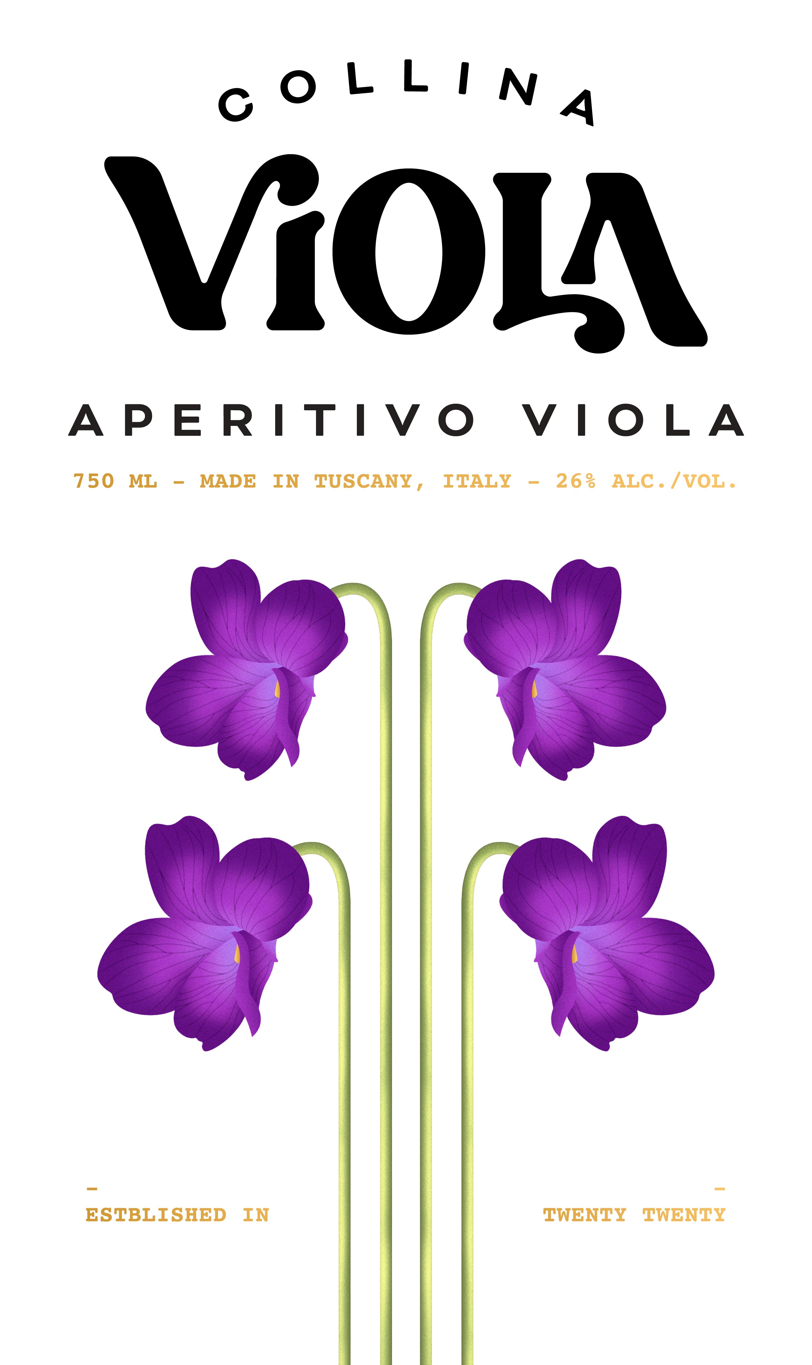
Collina Brands wanted their flagship product, Collina Viola, to have a modern vintage logo, label, and bottle. For the logo, they were looking for lettering that felt botanical and bold. The bottle needed a unique feature that speaks to Collina Viola's roots, and the label was to have Parma violets, the aperitivo's key ingredient, front and center.
Collina Brands wanted their flagship product, Collina Viola, to have a modern vintage logo, label, and bottle. For the logo, they were looking for lettering that felt botanical and bold. The bottle needed a unique feature that speaks to Collina Viola's roots, and the label was to have Parma violets, the aperitivo's key ingredient, front and center.
.02 DELIVERY:
.02 DELIVERY:
For the logo, I built a custom typeface where the letters of "VIOLA" interlock while staying legible, with the "O" centered so "COLLINA" sits perfectly aligned above it. "COLLINA" curves upward to represent the shape of a hill, a reference to the word's meaning in Italian. For the bottle, I designed debossed lines that form the shape of the Tuscan mountains, an abstract nod to the product's origin that also gives the bottle a better grip. For the Parma violets, I illustrated realistic, vintage-style flowers arranged symmetrically on the label. I kept the label overall minimalistic to keep the modern theme going.
For the logo, I built a custom typeface where the letters of "VIOLA" interlock while staying legible, with the "O" centered so "COLLINA" sits perfectly aligned above it. "COLLINA" curves upward to represent the shape of a hill, a reference to the word's meaning in Italian. For the bottle, I designed debossed lines that form the shape of the Tuscan mountains, an abstract nod to the product's origin that also gives the bottle a better grip. For the Parma violets, I illustrated realistic, vintage-style flowers arranged symmetrically on the label. I kept the label overall minimalistic to keep the modern theme going.
.03 RESULT:
.03 RESULT:
The project went through several rounds of revisions. It ultimately reached a stalemate with the decision-making team, so this direction wasn't selected. The bottle design, however, did move into production, as the client liked the engraved detailing representing the Tuscan Alps.
The project went through several rounds of revisions. It ultimately reached a stalemate with the decision-making team, so this direction wasn't selected. The bottle design, however, did move into production, as the client liked the engraved detailing representing the Tuscan Alps.



Let's connect!


UI/UX designed and built by me, in Framer
Updated 2026
Let's connect!
UI/UX designed and built by me, in Framer
Updated 2026
Let's connect!
UI/UX designed and built by me, in Framer
Updated 2026