
.01 REQUEST
A Connecticut farmer had started an experience-oriented public farm and needed to build brand recognition from scratch. He wanted a logo that felt warm and welcoming right out of the gate. His one specific ask was a cow wearing a top hat.
.02 CONCEPTS

Head of a cow with a hat cropped around a circle with some vintage text.
Illustration of a full cow wearing a top hat with bold text.
.03 THE WINNER
Rough Draft

Final Draft
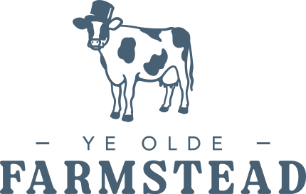
I traced a photo of his own dairy cows into a hand-illustrated logo instead of generic stock art, so it felt personal to his herd. An old-fashioned top hat and bold serif type gave it a timeless, welcoming feel. He loved the illustration from the start, so the cow stayed the same. The changes came in the type. In the rough draft, "FARMSTEAD" was the big, bold line. For the final, I flipped the hierarchy so "YE OLDE" leads in big serif letters, with "FARMSTEAD" smaller and spaced out below. I also added small tufts of grass at the cow's feet to ground it.
.04 BRAND IDENTITY
Primary
Horizontal

Wordmark

Icon

Extras
.05 RESULT
He approved it after just one round of edits, a quick color tweak. Then he rolled it out across the farm's full lineup of products and merch.


