
.01 REQUEST
Terra Tè is a tea truck company in Stamford, Connecticut, building their brand from the ground up. They came to me for a full brand identity. They were new to the branding world, so they needed guidance along the way, not just visuals. They wanted a custom font and a fun trademark. Together, these needed to carry their identity across the truck, packaging, and merch.
.02 CONCEPTS
A simple illustration of a man carrying stacked tea cups, with lowercase text that fits the gaps.

A bold font that stands out, paired with a simple tea tag illustration that frames the initials.
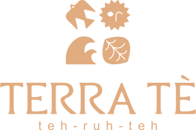
Built around the four elements, which also tie into tea making, with the type and icons styled in a boho look.
.03 THE WINNER

Rough Draft

Final Draft
I took inspiration from branding the client already liked. For the trademark, I created a playful character juggling multiple tea orders at once, giving the brand a fun, approachable personality that stood out from typical tea branding. They loved the character from the start, so it stayed the same. The changes came in the type. The rough draft used an existing font. For the final, I designed a custom typeface built from elements of that font, where every letter fits together seamlessly with no awkward gaps. We also settled on a final pronunciation, "tehr-rah-teh," and added it below the name so customers know how to say it.
.04 BRAND IDENTITY

Primary

Horizontal
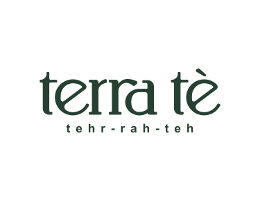
Wordmark
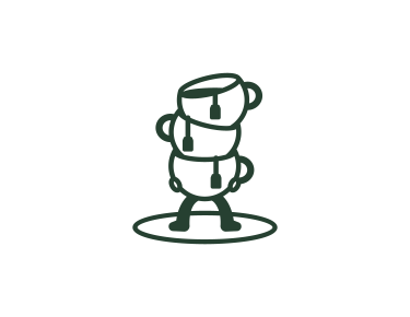
Icon

Extras
.05 RESULT
The client was completely new to branding, so we explored a few directions together before landing on the right fit. I guided them through what worked and why along the way. In the end, they landed on the custom font and icon I designed, which became the foundation of their full brand identity.


