
.01 REQUEST
Terra Tè is a tea truck company building their brand from the ground up. They were new to branding and marketing, so they needed more than just visuals. They wanted a custom font and a fun trademark that could carry their identity across the truck, packaging, and merch.
.02 CONCEPTS
Simple illustration of a man carrying multiple tea cups with lowercase text that fits gaps.

Bold font to stick out with a simple tea tag illustration with the intials inside.
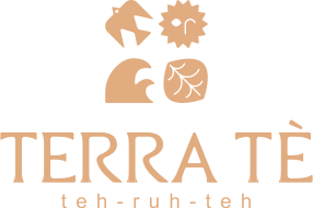
Created the 4 basic elements since they can also be tied into tea making. Stylized the type and icons in boho.
.03 THE WINNER

Rough Draft

Final Draft
I took inspiration from branding the client already liked. I designed a custom typeface where every letter fits together seamlessly, with no awkward gaps or spacing. For the trademark, I created a playful character juggling multiple tea orders at once, giving the brand a fun, approachable personality that stood out from typical tea branding.
.04 BRAND IDENTITY
Primary

Horizontal

Wordmark

Icon

Alternate
.05 RESULT
The client was completely new to branding, so we explored a few directions together before landing on the right fit. I guided them through what worked and why along the way. In the end, they landed on the custom font and icon I designed, which became the foundation of their full brand identity.


